It is important to have visitors on your website, regardless of what kind of site you operate. You will struggle to get organic traffic and leads without strategic SEO approaches. You must rely on reliable SEO services and web design and development to make your website visible in Google’s search engine results. Your website’s accessibility will boost its ranking on search engines and help you attract more visitors.
Do you know how to improve the accessibility of your website? Following a few steps will do the trick. This post will provide tips for improving the accessibility of your website. Let’s get started.
What are the Benefits of Making a Website Accessible?
Several reasons should motivate you to make your website accessible:
- Your target audience should have equal access to your website, services, and information.
- Your business risks penalties and legal action due to an inaccessible website.
- Demonstrate your commitment to your target market.
- You can expand your business by reaching a larger market within your target market.
Businesses rarely deliberately restrict access to their websites for people with disabilities. The truth is that many people wish to create an accessible website but first want to conduct their research on materials and costs. Let’s see how you can create an accessible website for your business.
How to Make a Website Accessible
When you’re ready to start making your website accessible, follow these 10 tips:
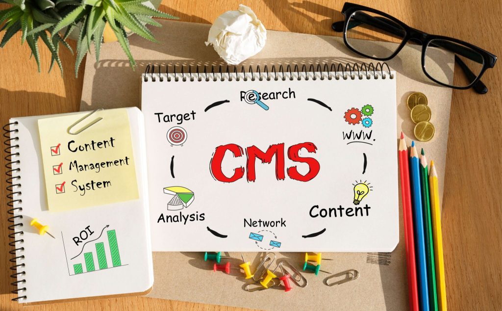
Use an Accessible Content Management System

There are several content management systems available for designing your website. There are many options, but Drupal and WordPress are among the most popular.
Make sure you select an accessible theme or template after choosing a CMS. The theme’s documentation provides accessibility advice and pointers for developing accessible content and layouts. It is also important to follow the same rules when choosing plugins, modules and widgets. You should ensure that video players and editing toolbars enable the creation of accessible content.
Proper Alt Text for Images
When using images, alt text is necessary to ensure that users can understand what the image is saying. Informational visuals like infographics need this. Whenever you upload an image with text, you should include its alt text, which should convey the message you intend to send.
One exception to this rule is when displaying images for decoration only. This way, a screen reader user will not be distracted by alt text. If you use images as links, ensure they have alt text.
Organize Your Content Using Headings
The heading structure of a document is helpful to users in navigating the text. Correct and strategic use of headings (H1, H2, H3, H4, etc.) will help screen readers understand your website content.
Follow the proper heading sequence and use CSS to distinguish presentation from structure. Design your text using a CSS class instead of selecting a header based on how it appears on the screen (which may confuse screen readers).
Make your Links Unique and Descriptive
When incorporating links in your article, use language that accurately represents the link’s destination. Clicking here is not considered a descriptive phrase for screen reader users.
As with sighted people, those with visual impairments can search for links with screen readers. Due to this, screen readers often fail to read links considering the rest of the page. When you use descriptive language, screen reader users understand the context of links.
Suppose you want your visitors to visit your website’s “About Us” page. Saying things like “Read more about our company here” is not a good idea. Instead, say: “We encourage you to read about us to learn more about what we do”.
Avoid Small Font Sizes
There’s a good chance those with low vision will have trouble reading the small text. Therefore, you should choose a font size that is appropriate for your website. You can increase conversion rates and make your content more accessible to all users by using large fonts and CTA buttons. When designing a website, ensure it includes a disability-friendly style page.
Be Careful When Using Colour

Approximately 8% of people suffer from red-green colour deficiency, which is the most prevalent. People will have trouble understanding your message if you only use these colours to indicate the required fields. The use of colour for identifying and arranging your material has significant advantages for users with learning difficulties.
Consider using colour to appeal to both audiences, but don’t forget to include other visual cues like question marks or asterisks. When separating content blocks, ensure that there is visual separation. Using various tools, you can assess colour contrast on your page to make it more visually accessible.
Make all Content Logically Accessible with the Keyboard
Many people with mobility issues can’t use a mouse, especially those who have repetitive stress injuries. Users can access content with the tab and arrow keys on their keyboards or alternative input methods like a single-switch input or mouth stick. Therefore, keyboard-only visitors can navigate the site properly if the tab order matches the visual order.
Using anchor links will allow keyboard-only users to navigate directly to relevant parts of long pages without navigating through other content. Users with keyboards only will not have to tab through the page navigation to access the main content when each page has a “Skip to main content” link.
There should be accessible via the keyboard to all menu items on sites with local menus that include several levels and subitems.
Label your Form Elements
An HTML web form is the most common method of engaging with a website. Using proper markup is essential for universal design because of the significance of web forms. Make the input elements meaningful and detailed. Users can now figure out what data they should provide quickly.
You can use CSS to style the label element into an icon or hide it by moving it outside the browser viewport.
Make Multimedia Accessible
For a high-quality user experience, videos, audio, and other multimedia components are essential. However, each user may have different needs depending on their limitations. Those with visual impairments have trouble reading text or seeing images, but they can listen to audio files. Deaf individuals can view videos but not hear the audio.
Therefore, offering readers as many ways to comprehend your content is ideal. You can enhance multimedia embeds by providing audio and video transcripts or allowing users to listen to the text instead of reading.
Be Careful When Designing Forms

It is essential to carefully design forms, so users will not find them challenging to use. It involves making the form user-friendly and clearly defining each field. Consider placing labels next to fields that correspond to them.
Provide brief instructions explaining what users need to know to complete the form correctly. You could add placeholders with text in the form fields for users. Thus, they’ll be better prepared to fill out the form.
The Takeaway
The planning stage is crucial when it comes to making a website accessible. Building an accessible website from scratch or modifying an existing one to meet these standards requires time.
Consider how customers with different needs might navigate your site in addition to checking over this list of suggestions.


